Q:

Study the given bar graph and pie chart to answer the following questions.

The bar graph shows the production (in thousand tonnes) of Wheat, Rice and Maize in different states.

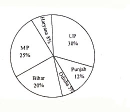
The pie-chart shows the percentage of agricultural land in the given six states.

Productivity = 

1.The productivity of which state is the maximum ?

1. Bihar       2. Haryana     3. Punjab     4. UP       5. MP


2.The production of which state is the maximum ?

1. Bihar       2. MP         3. Haryana       4. UP       5. Punjab


3.The prodution of wheat in punjab is what per cent more than the production of Maize in odisha ?

1. 350%       2. 250%       3. 300%       4. 200%       5. 400%


4.What is the ratio of the production of Rice in Bihar to the production of Wheat in Haryana ?

1. 2:3           2. 3:2           3. 2:1           4. 1:1             5. 1:2


5.If MP exports 40% of Rice at the rate of Rs.30 per kg and UP exports 30% of Rice at the rate of Rs.32 per kg, then what is the ratio of the income from the exports ?

1. 65:48       2. 31:42       3. 43:54       4. 57:62       5. 1:2

Answer

1. Answer : 2


Explanation : Productivity = Total production/area of Agr.land 


Productivity of UP = [ (35000+30000+25000) / (30/100) ] = 300000  


Productivity of MP = [ (30000+37500+27500) / (25/100) ] = 380000  


Productivity of Bihar = [ (22500+27500+25000) / (20/100) ] = 375000 


Productivity of Odisha = [ (22500+15000+10000) / (5/100) ]= 950000  


Productivity of Haryana = [ (30000+25000+35000) / (8/100) ] = 1125000  


Productivity of Punjab = [ (40000+35000+30000) / (12/100) ] = 875000 


The Productivity of Haryana is the maximum.  


2. Answer : 5  


Explanation : Production of Punjab is maximum = 105000 tonnes 


3. Answer : 3 


Explanation : Production of Wheat in Punjab = 40000 tones


Production of Maize in Odisha = 10000 tones


Required % = (40000 - 10000)/100 = 300% 


4. Answer : 4 


Explanation : The ratio of prodution of Rice in Bihar to the production of Wheat in Haryana = 25000 tonnes : 25000 tonnes = 1 : 1  


5. Answer : 1  


Explanation : Income of MP from export of 40% of Rice at the rate of Rs.30 per kg = Rs.39crore


Income of UP from export of 30% of Rice at the rate of Rs.32 per kg = Rs.28.8 crore 


Required ratio = 39 : 28.8 = 390 : 288 = 65 : 48

Report Error

View answer Workspace Report Error Discuss

118 26657
Q:

Study the following graph carefully and answer the questions that follow:

Water level of four major Rivers (in meters) in four different Months

1. what was the respective ratio between the level of River - C in September and the water level of River - B in June?

1. 91 : 101           2. 94 : 101           3. 51 : 103           4. None of these


2. If the danger level of all the four rivers is above 215 m, which river has not crossed the danger level in August but has crossed the danger level in July ?

1. River - A          2. River - B          3. River - C          4. River - D


3. What is the average water level of River - A in all the four months together ?

1. 224.50 m        2. 212.25 m        3. 210.75 m        4. 222.25 m


4. In which river and in which month respectively the water level is highest ?

1. River - C in August     2. River - D in September     3. River - B in July     4. River - D in August


5. If the water level of River - A in July is decreased by 20 percent, then what will be the water level of River - A in July ?

1. 156 m              2. 162 m              3. 164 m            4. 152 m

Answer

1. Answer : 4 


Explanation : The water level of River-C in September = 184 and water level of River-B in June = 202


Required ratio = 184 : 202   => 92 : 101 


2. Answer :  2


3. Answer : 3


Explanation : Average water level of River-A in all months =196+205+230+2124= 210.75 m


4. Answer :  4 


5. Answer : 3


Explanation : Water level of River-A in July after decreasing =205×80100 = 41 x 4 = 164m

Report Error

View answer Workspace Report Error Discuss

13 8139
Q:

Bar chart is suitable for

A) Minor work B) Large project
C) Major work D) All of the above
 
Answer & Explanation Answer: A) Minor work

Explanation:

Bar_chart_is_suitable_for1560488875.jpg image

A bar chart or bar graph is a chart or graph that presents data with rectangular bars. Bar charts is suitable for minor works for comparing between categories of data.

Report Error

View Answer Report Error Discuss

8 5993
Q:

The following chart represents the number of students who passed the CAT exam or the XAT exam or the CET exam or None of these exams. (Assume that there are no students who passed more than one exam.)

             Number of students who qualified CAT/XAT/CET Exams

1.  Which year showed the best result in MBA entrance exams (in terms of percentage of students who cleared) ?

1. 2000               2. 2001               3. 2002               4. Cannot be determined


2. What was the percentage of students who succeeded in at least one of three exams in 2000 ?

1. 82.4%             2. 82.8%             3. 82.35%           4. 83.3%


3. What is the percentage increase in the number of students in 2002 over 2000 ?

1. 30%                 2. 17.64%           3. 117.6%           4. 85%


4. What is the percentage of students who cleared CAT in 2000 ?

1. 19.56%           2. 12.65%           3. 14.28%           4. 11.76%


Answer

1. ANSWER : 2  


Explanation -  Compare the respective pass percentage for three years : 2000, 2001 and 2002   


= (140 x 100)/170 < (150 x 100)/180 and (150 x 100)/180 > (160 x 100)/200


 = 82.35% < 83.33% and 83.33% > 80%


2. ANSWER : 3  


Explanation -  Total percentage of students who succeeded in at least one of three exams in 2000 = (140 x 100)/170= 82.35 %   


3. ANSWER : 2  


Explanation -  Total percentage increase in the number of students in 2002 over 2000 is = (30 x 100)/170 =17.64 %  


4. ANSWER : 4  


Explanation -  Total percentage of students who cleared CAT in 2000 =(20 x 100)/170 = 11.76 %

Report Error

View answer Workspace Report Error Discuss

23 4656
Q:

The bar chart shows the sales (in '000 units) of 4 mobile brands for 3 years.

If for any year, the sales of a brand is more than average sales of these four brands in that year, then it gets a star. Which brand has the maximum stars?

A) Brand 3 B) Brand 3 and 4 both
C) Brand 4 D) All brands
 
Answer & Explanation Answer: C) Brand 4

Explanation:
Report Error

View Answer Report Error Discuss

3 4431
Q:

The following bar graph indicates the production of sugar (in lakh tonnes) by three different sugar companies P, Q and R over years 2009 to 2013.

Production of Sugar by Companies P, Q and R during 2009 - 2013

1. The percentage increase in production of Company Q from the year 2009 to the year 2013 is :

1. 80%              2. 90%              3. 60%              4. 100%


2. The average production over the years 2009 - 2013 was maximum for the Company(ies):

1. Q                   2. P                   3. R                   4. P and R


3. The percentage rise or fall in production of Company Q as compared to the previous year is the maximum in the year :

1. 2011             2. 2010             3. 2013             4. 2012


4. The percentage of production of Company R to Production of Company Q is the maximum in the year

1. 2010             2. 2009             3. 2011             4. None of these


5. The ratio of the average production of Company P during the years 2011 to 2013 to the average production of Company Q for the same period is :

1. 23 : 25          2. 27 : 29          3. 15 : 17          4. 9 : 11

Answer

1. Answer : 4


 Explanation : Required Percentage =100-5050×100= 100% 


2. Answer : 4 


Explanation : The average production of P = 60+90+50+100+805= 76 


The average production of Q =50+70+70+80+1005  = 74 


The average production of R = 70+80+90+70+705 = 76


Maximum average production = P and R both


3. Answer : 2 


Explanation : The percentage rise in 2010 =70-5050×100 = 40% 


The percentage rise in 2011 = 70-7070×100= 0% 


The percentage rise in 2012 = 80-7070×100= 14.28% 


The percentage rise in 2013 =100-8080×100 =25% 


4. Answer : 2


Explanation : The percentage of production of Company R to production of Company Q  


in 2009 =7050×100 = 140 


in 2010 =8070×100 = 114.28 


in 2011 =9070×100 = 128.57 


in 2012 = 7080×100= 87.5  


in 2013 = 70100×100= 70 


5. Answer : 1


Explanation : Average production of company P during the years 2011 to 2013 =50+100+803 = 2303 


Average production of company Q during the years 2011 to 2013 =70+80+1003 = 2503


Required ratio = 23 : 25

Report Error

View answer Workspace Report Error Discuss

13 4118
Q:

The bar chart shows the sales (in '000 units) of 4 mobile brands for 3 years.

In 2017 the sales of each brand increased by the same percentage as it did in the year 2016. What will be the approximate average sales (in units) of mobiles per
brand in year 2017?

A) 9175 B) 8360
C) 9436 D) 9678
 
Answer & Explanation Answer: A) 9175

Explanation:
Report Error

View Answer Report Error Discuss

5 4049
Q:

A bar graph showing the heights of six mountain peaks. Study the bar graph and answer questions.

Which peak is the second highest ?

A) B B) C
C) A D) E
 
Answer & Explanation Answer: B) C

Explanation:
Report Error

View Answer Report Error Discuss

3 3735